Sawdust Art & Craft Festival Flyer
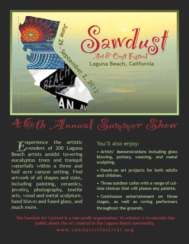
For my final design for the advertisement for the Sawdust Art & Craft Festival, I wanted to create something that fully captured the essence of the event while not being too distracting or gaudy for viewers. I used two different fonts to add dimension, but kept the swirly font for the headlines and the plain font for the info so that it would be easy to read. I kept to Sawdust's color-scheme on their website with the greens and the pop of red. In the background, I have a picture of a Laguna Beach sunset and I really liked how the sun fell over the word "Sawdust." I put pictures of artwork from the festival in the California outline because the event is California's, and possibly America's, biggest annual art show. I chose the dates to type on a curved path because they are not hard to read, but the curve makes them stand out so that a viewer does not forget them. It also adds another cool dimension. The red font is proportionately spaced throughout and it carries the eye through the page. Only short snippets or headlines are done in red so that it does not overpower the greens. I used the paragraph tool to make my paragraphs more enticing and clear so that one can quickly scroll through and remember important details about the Festival.
Atlantic Brewers Company Logo
Using Adobe InDesign, I created this logo for Atlantic Brewers, a fictional company. I like this design because it's simple, yet expressive of the company. It looks good big or small, so it would be successfully placed on anything from a sign to an advertisement to a business card. The wheel itself represents the "Atlantic" aspect, while the beer in the middle, as opposed to the traditional anchor, represents what the company is all about. It works for an international company because ships usually do exporting and sailors traditionally love beer.
I created the wheel with the Eclipse Tool and subtracting. I kept the font classic, simple, and all-capitals because it gave the logo a classic feel. Besides the beer, I only used two colors to keep it simple and avoid distortion when sized smaller. The white letters contrast nicely with the navy wheel and the wider spacing makes them easy to read. To make this work, I used Type on a Path and the type spacers in the Control Bar. The logo would be recognizable without some, or even all, of the letters because it is a shape that can stand alone and the signature beer in the middle sets it apart from just any old ship wheel.
Hollywood Restaurant Menu
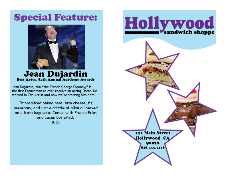
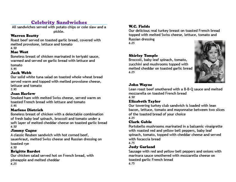
For this design, I chose three pages, divided into two columns, to fit all the menu items in an appealing fashion. Since the logo provided by InDesign featured a deep purple as the headline color, I stuck with the purple for all my headings. I complemented the purple with a pale blue background that I used as the rule under my headings. I also used the same font for all my headings to keep continuity and not cause too much clutter. For the descriptions, I chose I plain font that was not too distracting.
In class, we practiced creating menus that had circles with pictures of the food in them. Since this menu was Hollywood themed, I put sandwich and ice cream pictures in stars. Also, because the menu had so many items, I didn't want to clutter it too much with too many pictures, so I just chose one per section. I thought the picture of Shirley Temple drinking a soda was very fitting and it made the menu endearing.
I decided to base my special feature sandwich on Jean Dujardin. I featured Jean Dujardin because he won the 84th Annual Academy Award for Best Lead Actor in The Artist. It was incredibly convenient and coincidental that the Oscars happened to be on while I was finishing up my project, so I thought it was fitting to make the Best Lead Actor the star of my menu. Since he's French, I also made the sandwich French-inspired.